Comic Background Design: The Definitive Guide to Crafting Immersive Panel Art
Staring at a blank panel? You’ve drawn a dynamic character but the background feels empty, flat, or out of place. That empty void drains energy from your story and screams amateur. Mastering comic background design changes everything—it grounds your action, builds mood, and pulls readers deep into your world. This guide hands you the exact skills to create backgrounds that make every panel unforgettable.
Why Comic Backgrounds Matter More Than You Think
A comic background does more than fill white space. It sets the location, reveals time period, amplifies emotion, and guides the reader’s eye. In Understanding Comics, Scott McCloud points out that backgrounds anchor the reader’s sense of place and make character actions feel real. Without a clear setting, readers lose spatial awareness—and interest.
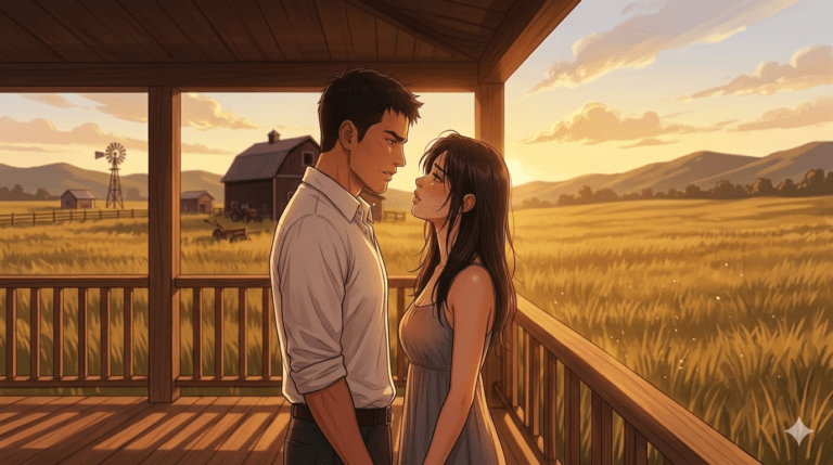
When you pour energy into a comic background, you show respect for your story. The background becomes a silent narrator. A rainy alley screams tension, while a sun-drenched meadow softens the mood. Neglecting the background cheapens even the most expressive characters. Make the background an active player in your panel, not an afterthought.
The Core Elements of a Powerful Comic Background
Every compelling comic background rests on three pillars: depth, texture, and purpose. Depth uses perspective and overlapping forms to create three-dimensional space on a flat page. Texture adds grit, smoothness, or atmosphere through lines, screentones, or digital brushes. Purpose means the background matches the panel’s story beat—never distract, always support.
You also need clear value separation. Keep foreground, midground, and background distinct with contrast and edge control. A powerful comic background works even when glanced at for a split second. Simplify complex environments into readable shapes, then layer details that reward a closer look.
Types of Comic Backgrounds: From Simple to Spectacular
Choosing the right style of comic background saves time and strengthens your narrative. Here’s a quick reference table:
| Background Type | What It Is | Best Used For | Quick Example |
| Solid or gradient fill | Single colour or smooth gradient without detail | Intense emotional close-ups, quick punchlines | Manga rage explosion behind character |
| Pattern or halftone | Repeating dots, lines, or screentones | Retro comic feel, indicating mood or energy | Speed lines, dot gradients for shock |
| Photographic with filter | Real photo adjusted with contrast, threshold, or halftone | Urban settings, quick realistic environments | City skyline turned into high-contrast art |
| Hand-drawn stylised | Simplified line art, often loose or geometric | Stylised indie comics, fast storytelling | Flat trees, blocky buildings, thick outlines |
| Fully illustrated realistic | Detailed rendering with full perspective and lighting | Key establishing shots, epic spreads | Detailed castle interior with shadows |
Mixing types within a single issue creates visual variety. A powerful comic background doesn’t always mean complex—sometimes a solid gray with action lines punches harder than overworked scenery.
Perspective Basics for Believable Settings
Nothing kills a comic background faster than broken perspective. David Chelsea’s Perspective! for Comic Book Artists lays out a simple rule: establish a horizon line and vanishing points before drawing a single wall. One-point perspective suits corridors and roads staring straight ahead. Two-point works for building corners and most interior shots. Three-point adds dramatic height for cityscapes seen from below.
Start with a ground plane grid. Lightly sketch rectangles that follow your perspective guides. Even if you later cover parts with characters or speech bubbles, the underlying structure holds the space together. Digital tools like Clip Studio Paint offer perspective rulers that snap every stroke, but hand-drawn construction teaches you to see space more deeply.
Using Halftones and Screentones for Classic Comic Feel
Halftones turn a flat comic background into a textured world. Traditional comics used dots of varying size to simulate shading and colour. Digital halftone brushes replicate that effect in seconds. Screentones—popular in manga—use repeating line patterns, crosses, or stippling to build atmosphere without distracting from the foreground.
Apply halftones selectively. Too much pattern muddies readability. Place heavier tone density behind lighter characters to make them pop. For a retro comic background, drag a halftone layer over a solid area, set it to Multiply, and drop the opacity. The grainy texture instantly adds nostalgia and weight.
Digital Tools That Simplify Comic Background Creation
Software flattens the learning curve. Clip Studio Paint’s perspective rulers, 3D mannequins, and ready-made background materials allow you to block in a scene rapidly. Procreate’s quick shapes and assisted drawing make straight lines and ellipses effortless. Adobe Fresco brings vector precision to organic brushwork.
The Clip Studio Assets store offers thousands of user-created buildings, trees, and furniture pieces you can drag into a panel. Use them as a base, then hand-draw over to inject your style. Remember, tools accelerate the process—not replace your artistic choices. Every comic background still needs your creative filter to feel cohesive.
How to Match Background Style with Your Story’s Tone
A horror comic background uses shadow pools, skewed angles, and jagged textures. A slice-of-life romance leans on soft gradients, flowers, and tidy interiors. Align background rendering with the emotion of the scene. If the script calls for chaos, break perspective rules intentionally. Tilt the camera, warp buildings, add scribbly energy lines.
Colour palette unifies tone. Restrict backgrounds to a limited range of hues that complement character colours. Muted browns and teals evoke melancholy; neon pinks and cyans scream cyberpunk. Before rendering, create a small mood board for your comic background referencing films or paintings that match the desired feel. This simple prep aligns your entire team or solo workflow.
Common Mistakes That Ruin Comic Backgrounds (and How to Fix Them)
- Inconsistent light source: Draw a small sun icon at the top of your canvas to remind yourself where shadows fall. Adjust every shadow accordingly.
- Flat staging: Place objects at three distinct depths—foreground silhouette, midground action, background context. Check layers.
- Tangents: Lines that touch or barely miss each other confuse spatial depth. Offset overlapping shapes clearly.
- Over-detail competing with characters: Blur or lighten the farthest layer. Characters must sit in front of the comic background, not fight it.
- Copy-paste fatigue: Reusing a panel exactly kills immersion. Alter lighting, add new props, or shift the angle slightly each time.
Spot-check each panel by squinting. If the background dissolves and the character still reads clearly, you’ve nailed the balance.
Step-by-Step: Designing a Cityscape Comic Background
- Draw a horizon line across the panel. Place two vanishing points far apart.
- Block in simple boxes for buildings, varying heights and widths.
- Add windows, ledges, and signage using repetitive shapes that follow perspective.
- Drop a halftone layer over the shaded sides of buildings; leave lit sides cleaner.
- Introduce foreground elements—a lamp post, cables, or a fire escape—that overlap the midground.
- Soften the farthest buildings by lowering opacity or using thinner line weight. This builds atmospheric depth instantly.
Step-by-Step: Creating a Nature Scene Background
- Establish a single horizon line with gently rolling hills or treetops.
- Sketch organic shapes: clusters of foliage, winding paths, irregular rock formations.
- Use varied line weight—thick outlines for nearest trees, thin and broken lines for distant ones.
- Apply screentones or hatching to shadowed areas, always keeping the light direction consistent.
- Add small natural details: grass tufts, falling leaves, birds in the sky. These micro-elements bring a comic background to life without clutter.
- Layer a faint gradient from top to bottom—lighter near the horizon, richer at the foreground—to mirror natural light falloff.
Adapting Backgrounds for Webcomics vs. Print
Scroll-format webcomics demand elongated, vertical comic background designs that guide the thumb downward. Use repeating patterns or panoramic shots that split naturally across panels. Print, with its page spread, relies on left-to-right flow; create wide establishing shots that anchor the eye at the gutter.
Screen colour profiles affect contrast. A bright screen can wash out subtle halftone details, so boost contrast slightly for web. Test your comic background on a phone at 50% brightness. If readability holds, you’ve got a solid design. Platform matters—optimise for where readers actually view the art.
Advanced Techniques: Adding Depth with Foreground, Midground, Background
Depth transforms a flat sketch into a world you could walk into. Foreground objects should be darkest and most detailed, often slightly out of focus or cropped at the panel’s edge. Midground hosts the main action. Background provides context and mood, kept lighter and less textured.
Use atmospheric perspective: distant elements lose contrast and take on the hue of the sky. In black-and-white comics, reduce line density for faraway objects. Overlap is your strongest tool—place a tree branch or window frame in the extreme foreground to frame the scene and push the comic background deeper instantly.
Tips for Reusing Backgrounds Without Looking Lazy
You can reuse a comic background if you tweak it each time. Shift the camera angle slightly, change the time of day through shadow placement, or add new props and posters. Build a library of asset layers—clouds, crowds, vehicles—that you can swap in and out.
In dialogue-heavy scenes, reuse the establishing shot but zoom in, cropping out repetitive areas. Readers accept reused settings when the emotional focus stays on characters. Just never mirror-flip an entire panel; the change in light direction and text placement shatters consistency.
Frequently Asked Questions
What is a comic background?
A comic background is the visual setting behind characters in a panel, including environments, props, and atmospheric effects. It communicates location, time, and mood.
Why are backgrounds important in comics?
They anchor the story, enhance immersion, and guide the reader’s emotional response. A strong comic background makes the fictional world believable and supports narrative clarity.
How do I draw a comic background for beginners?
Start with simple perspective grids—one-point perspective for straight corridors. Sketch basic shapes, add silhouettes, and keep detail minimal until you’re comfortable with spatial construction.
What tools do professional comic artists use for backgrounds?
Clip Studio Paint, Procreate, and Photoshop are industry staples, often paired with 3D reference models and custom brush packs for halftone and texture work.
Can I use photo backgrounds in my comic?
Yes, but always process them through filters, threshold adjustments, or hand-drawn ink overlays. Raw photos clash with line art; a treated photo blends into a cohesive comic background.
How do I make a comic background look dynamic?
Use dramatic camera angles, strong foreground elements, motion lines, and high contrast. Push perspective extremes and layer overlapping forms to inject energy into the panel.
Your comic background carries as much storytelling weight as any line of dialogue or facial expression. Start every page with a quick thumbnail that maps light, depth, and mood. Practice pulling reference from real life—snap photos of alleyways, parks, and rooftops, then reinterpret them through your ink lines. Share your experiments, ask for feedback, and never settle for an empty void behind your characters. Ready to make every panel unforgettable? Grab your sketchbook, apply these techniques, and tag us when you post your newest scenes. We are eager to witness the worlds you create.
About the Author: Alex Rivera is a comic artist and visual storytelling instructor with over a decade of professional experience. His work appears in independent graphic novels and creative workshops worldwide. He combines traditional inking skills with modern digital workflows to teach artists how to create powerful, publication-ready pages.